Thinking Outside the Window: Why Do All OS's look the same?
When you first come across a new operating system, what's the first thing you look for? Chances are, it's the user interface. You immediately hope that what's under the hood is reliable, secure, fast and stable - and quite evidently, there's only one way to test all of these, and that's by using it. But before you are prepared to do that, chances are you want it to look nice. Stable Operating Systems, no matter how fast or stable, are pretty much ignored these days if they don't have a pretty nice UI. As proof, how many of us use a console?
With all the distributions of Linux, the various iterations of Windows and MacOS, it's probably quite clear to you now - your standard is an icon-filled desktop, with some form of bar/dock that allows access to programs and files that you use the most. And if you consider the original Xerox system that both Apple and Microsoft were "inspired by," we certainly have not come very far. Our systems are faster, can handle far more graphic capabilities than before, and yet our interactions with our desktops haven't changed at all. The greatest leaps would have to be the Dos Manager to early Windows versions to then Windoes 95. The Mac OS has stayed roughly the same in concept, except eventually adding a dock. And Linux has always been somewhere between the two - sometimes with innovations on the bar/dock notion, but still in the form of a bar/dock.
As for me, I'm tired of seeing squarish icons on a wallpaper, with a bar spanning one or more of the screen sides. Have we honestly come up with nothing new?
A large part of the reason why the look has not changed is because of how we view the operating systems. They contain programs which we must work within - in Windows, these are contained programs - like working within a blackboard, placed on a table top. In the Mac/Linux world, items are individually contained - like mini blackboards scattered across the surface of your table. Icons are little push buttons that cause these blackboards to appear on our table top. The mouse is like the tip of our finger, moving around and selecting items. Basically, the operating system's user interface is modelled like a real world setup.
Obviously, it's easier to design in the world we know. It's all the more graspable and intuitive - yet, we've still cornered ourselves by restricting our image to a single image.
As an example, consider the mouse. You intuitively place your hand on it - move it up when you want the cursor to move up, move it left when you want it go left, etc. Pretty intuitive, right?
But what if you've never interacted with a computer in your entire life, and immediately associated the mouse with another similarly shaped object in your mind? When I first taught my grampa to use a computer, I was pretty taken aback when I saw him using the mouse - something he was using for the first time ever. He started moving it as though it were a car. Pushing it forward to move up, then rotating the mouse as though it were making a left hand turn, and then moving it forward again.
I invite you - if you haven't already done so - to try this out for yourself. What you'll find, if you can manage the mental switch, is that you immediately get a different impression. You sense that the mouse isn't working properly. Here you have the mouse, driving forward, making a left turn, and continuing forward, and all the time it just moves up.
If you get an unsettling feeling when you do this, I ask you - what does this really mean? To me, it means that our mental image of operating systems can change. Right now, the desktop of computer precisely represents a physical desktop. Icons represent buttons. And yet despite this, it's still possible, when using the mouse in a different manner, to feel like the interface should function differently.
What if the "desktop" was a series of roads, on which we'd have to drive the mouse to the icon - a "house" - we wanted to open up. What would the interface look like then? Maybe it would be less efficient - or maybe not. Maybe switching the representation would open new doors of possibilities we hadn't considered before.
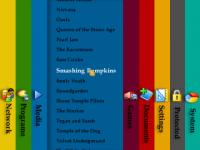
As another example - what if our original operating system user interface was not a series of buttons on a table top. What if we considered them as books in a shelf - organized in a manner of our choosing. In other words - long vertical bars spanning the screen, instead of small square icons. Why do we need icons? Each vertical bar could represent a different category - Programs, Pictures, Games, etc. Within each "book", the files and programs would be indexed rather than laid out as buttons.
So let's say you want to open up Photoshop? Go to the P tab much like you would in the Yellow Pages, and there you have it. Or, completely differently - we could break out of the entire "window" concept and just have things contained in a single box - like a sliding desk...