7 Steps to Writing an Amazing Resume
Since sharing my resume template I've received plenty of feedback from job seekers, HR and hiring managers - all of whom value its purpose. Two (now former!) jobseekers even shared that as soon as they used my template, they were getting calls.
Something about this template works, and given the traction it's getting others, I wanted to share - in more detail - why this approach works so well.
Before continuing, let me give an important disclaimer: This resume isn't a miracle cure that's going to land anyone their dream job. Unless they're filled with lies, resumes are only as good as the candidate themselves. But they can also be a whole lot worse. This template and approach are all about maximizing the potential candidates have by highlighting and summarizing key areas.
Last point before beginning: If you don't know me, it's worth stating this advice comes from more than a decade of having hiring a broad range of coders: straight out of college, high school, bootcamps. I've hired interns, entry-levels, juniors, intermediate, senior engineers, team leads, full stack devs, front-end devs, mobile devs.
First Thing's First: Know Your Audience
Knowing your audience is just as critical with your resume. While there many who will see your resume, the main person you're targeting is the Hiring Manager.
Who, exactly, is a Hiring Manager? A hiring manager is a temporary title you take on when you're hiring for your team. They are generally the final decision maker as to whether or not you'll be extended an offer (of course, many others have input.)
Imagine an Engineering Manager, let's call him Lumbot.
Lumbot has an open role on his team.
An open role is the product of an understaffed team - and understaffed teams are busier, stressed out. Lumbot is motivated to fill the role quickly, to help his team. He wants to find the best person in the shortest amount of time.
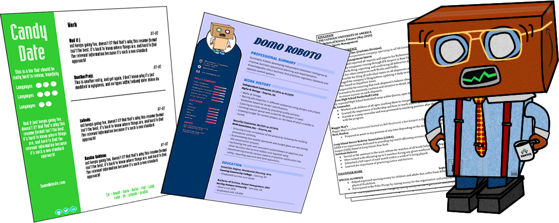
The problem is - there's no consistency to the resumes he's getting.
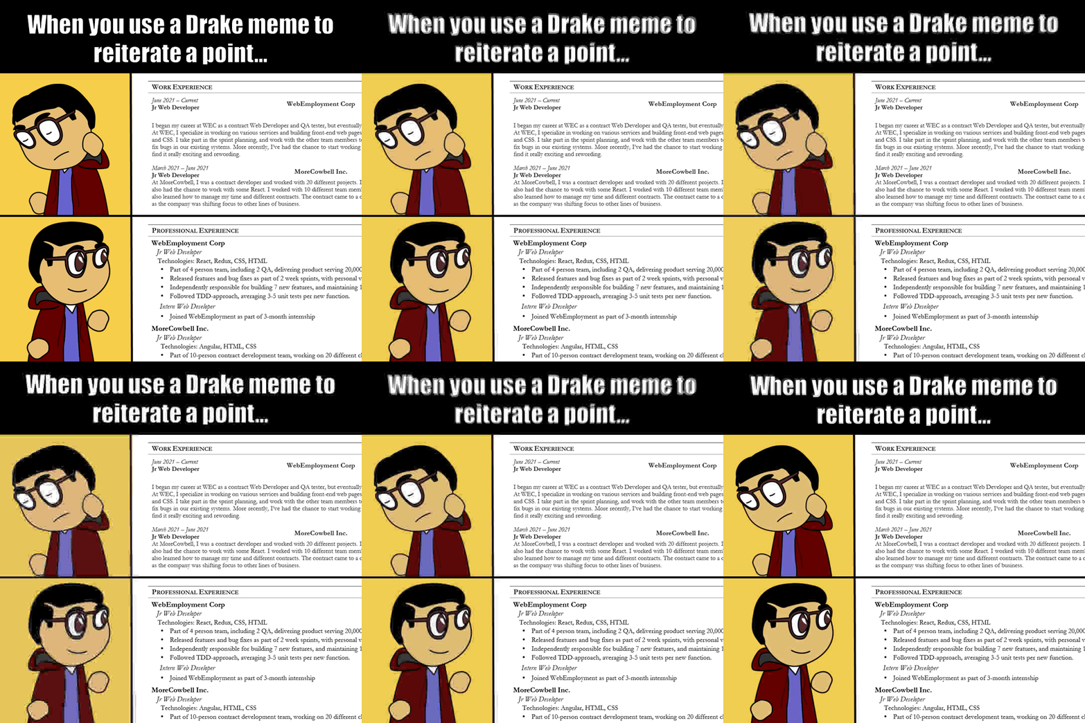
Different styles, different formats. He spends more time trying to find the relevant information on each resume than thoroughly reviewing their content.
In fact - Lumbot doesn't spend more than a few minutes on a given resume!
He shudders when he sees a poorly formatted 3 page auto-biographical memoire of one's professional life. He likes the colorful and less-traditional resumes - but all that personalization means even less predictability.
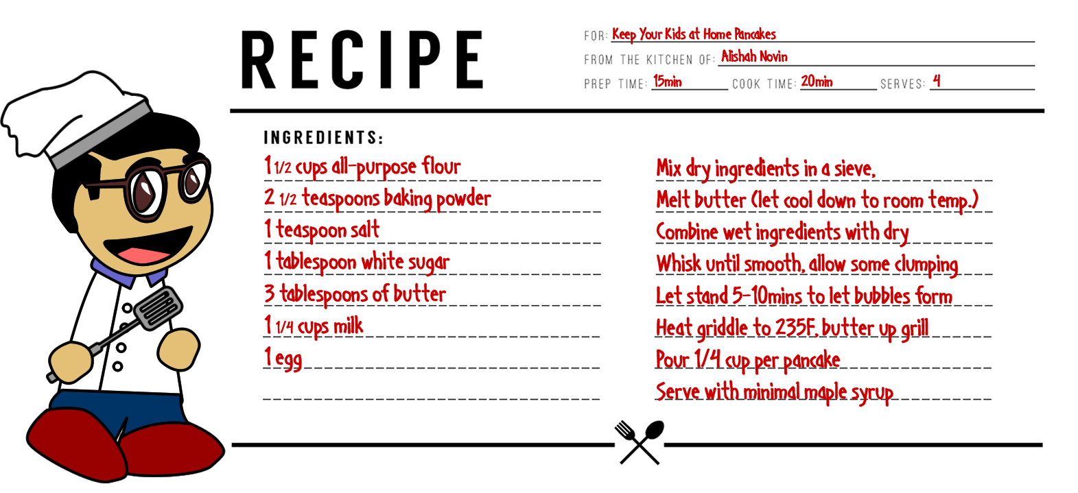
A Quick Aside About Pancakes
Resumes as Recipes
1. Headings: Keep Them Simple
- Start with your name (obviously)
- If you have a relevant degree, (Comp Sci, Physics, Math, Computer Engineering) for example, you may want to include 'BSc' beside your name
- Include your desired title under your name. This may seem strange - but especially when you're making a career change, or you've held multiple titles, having your title makes it clear what role you are actively pursuing. There's no ambiguity.
- Include just your phone number, email and portfolio if you have one (and you should!)
- Fight the temptation to add more. There have been many instances where I or other hiring managers I've worked with have kept returning to the resume to grab contact information because it was so much easier to navigate than whatever system we were using to track candidate information. This is a huge win for any candidate.
2. Career Summary / Professional Summary
- This is where the real magic is. People form their first impressions in the first 7 seconds they meet someone. People stay on webpages less than 15 seconds while they decide if the website is relevant to their needs. This section is your way of keeping the Hiring Manager's attention.
- Instead of making the hiring manager sift through all your experience to get a sense for how many years of experience you have, and all the skills you have, why not provide the tl;dr in a short summary?
- Quantify whatever you can here.
- This is especially helpful when you are changing careers - you can summarize and generalize your previous experience so that it remains relevant and useful.
- When listing the technical languages, or tools you know avoid giving yourself a ranking. It's subjective, meaningless, and it only takes up space.
- Instead, order things in terms of priority: either with what you know best, or what you know the hiring manager is looking for (presumably, those should be the same things.)
- Include soft-skills, leadership experience and other valuable skills here too.
- Often, I see people tote their communication skills - but their resume is disorganized and all over the place. Consider: Your resume is a form of communication. Be brief, be direct.
- If you nail this section, there's a good chance the rest of your resume is merely a formality that the hiring manager will quickly glance over.
3. Experience (or Projects if you have no relevant Experience)
- List the technical stuff first, so it's clear and obvious.
- Don’t give a description of the company or describe the generic role. That’s not needed.
- Focus on wins, and unique responsibilities, accomplishments,
- 3-5 bullet points, avoid full sentences or paragraphs.
- Quantify, quantify, quantify. Whatever you can and whenever you can.
- Even a low number is better than no number
- For example: Part of a 7 person team delivering a product serving 1,500 users, releasing updates every 2 weeks, on a codebase with more than 150,000 lines of code, 100 classes, 15 tables.
4. Changed Roles? Are you a Sr or Manager that has lot of less-relevant 'Jr' experience?
- It's hard to let go of a lot of experience you're proud of - but if it's not immediately relevant to the role you're pursuing, why include it?
- Generalize the key strengths and skills from your previous experience and leave it at that.
- Don't completely eliminate it, because even just one line tells a lot: You change roles, you are more senior, you have a lot of experience from which you can draw.
- At the very least, it makes for a good ice breaker during the interview - allowing the Hiring Manager to ask you a softball question. "What was the biggest cake you made?"
5. Projects: List the notable ones, even if you have years of Professional Experience
- Projects are great to see. You don't need to have them, but they say a lot about your passion, your goals, your growth. If, after listing your relevant experience, you have room for some projects then list them! If you don't have much experience (or none) then list all your projects!
- Follow the same approach as above - detail things just as you would your professional experience
6. Education, Accreditations, Awards, Certifications, etc.
- This section is pretty straightforward, but the key is: don't list more than you need to.
- If you did anything particularly notable (e.g. Cognitive Machine Learning) include it, but otherwise don't waste too much real estate (unless you're short on experience.)
- Whatever you were tempted to put in your Header, include in your Footer.
- GitHub links, LinkedIn, Medium, YouTube, CodePen, Behance, whatever you want to showcase
- Include URLs, and not just hyperlinked text: resumes get printed, they get passed around. It does take up more space, but it makes it easier for someone to find you.
- If you have nothing to include, just re-state your email address. Footers are a good way of denoting the end of your resume - especially if you include a simple horizontal line.
